7 Tips to Create Amazing Homepage and Landing Page of Your Website
Defining a Homepage and a Landing Page
Homepage is the most important page of a website that provides the potential customer with a long lasting impression of your website and consequently, the products and services the website provides. The main objective of every homepage is always to appeal to its visitors, interest its readers, and finally ensure that the brand they are placing their interest in is trustworthy.

A landing page, on the other hand, is tightly oriented and has a clear message, relevant material. Its aim is to convert, whether that means generating leads, triggering telephone calls, through sign-ups or starting an online chat with potential customers. In other words, a landing page with a clear call-to – action is a condensed and more succinct version of a homepage.
Key Differences Between a Homepage and a Landing Page
Now that we know what is a homepage and a landing page, let’s have a look at the key differences between these two.
- Audience/Purpose: Landing pages show only the required information to the prospective clients when they search for something. So, the landing page must be customized to audience type. The audience can directly get what they want from the landing page instead of having to explore the website organically.
- Links: While a Landing Page has only one aim/objective i.e. to convert a prospective client to a regular customer, the home page has to bear a lot of load. A homepage can have navigation bars or menus to link the entire website to the homepage. A landing Page does not have any of such links.
- Content: Even if you may be using some of the same details that you placed on your homepage, a landing page can only include material that is unique to the offer, product or service you are trying to promote. Unlike organic traffic to your site, you know what advertisements your visitors brought to your landing page and what search keywords. As a consequence, certain searches or advertisements will be unique to your landing page.
- Call to Action: Landing pages should have some kind of Call-to – Action (CTA) that enables the viewers to convert. Unlike landing pages, the homepage is unlikely to have a clear and widespread CTA because it is mainly used as a tool.
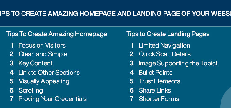
Tips to Create Amazing Homepage
- Focus on Visitors: Let your visitors know that you care for them by answering all their queries using any media to reach them. This creates a trust relationship with the prospective clients from the very beginning.
- Clean and Simple: Cluttered and busy websites are difficult to read, slow on loading, and frustrating to comprehend. Your goal is to give your visitors the knowledge and guidance they need in as little space as possible, while at the same time achieving the results you need.
- Key Content: A home page must include the Key content i.e. Headline, subheading, Call to Action, key features, and contact details.
- Link to Other Sections: Besides providing a navigation bar, the content on the home page can contain links to other sections of the website through the use of Call-To-Action or hyperlinks.
- Visually Appealing: Ensure to use an image on your homepage to provide this feature depending on the theme of the website or as it may suit the requirements.
- Scrolling: Use this feature on your website so the user does not miss on important details.
- Proving Your Credentials: Do this by providing the testimonials of existing clients, awards won, the profiles of your partners etc.
Tips to Create Landing Pages
- Limited Navigation: A landing page must not have any other type of action except the Call-to-Action.
- Quick Scan Details: Present full but clear descriptions of your purpose to your visitors such as including the details of a webinar when you are inviting them for along with its purpose.
- Image Supporting the Topic: An image on the landing page must be in accordance with the topic being presented so as to clarify the objective on seeing the image.
- Bullet Points: Deliver the purpose of your campaign in short, quick-to-read sentences. Lay them out for quicker consumption in bullet points.
- Trust Elements: With an abundant use of elements of trust, such as one-sentence testimonials or anecdotes, prove your campaign is trustworthy. It will allow the visitors to make your Call-to – Action work.
- Share Links: Within a single row, or column, promote your social media connections. Make it easy for your visitor to tweet about or post what they get from your landing page.
- Shorter Forms: When you ask for information from your visitors you don’t have to ask for a lot of it. Make it fast and painless for them to type in. It would be enough to get their full name and their email address.
With these above-mentioned unique and extraordinary tips to create amazing homepage and landing page of your website, FireStartUp can help you to stand you apart from the crowd. Reach us today to give your website a new and catchy look.

